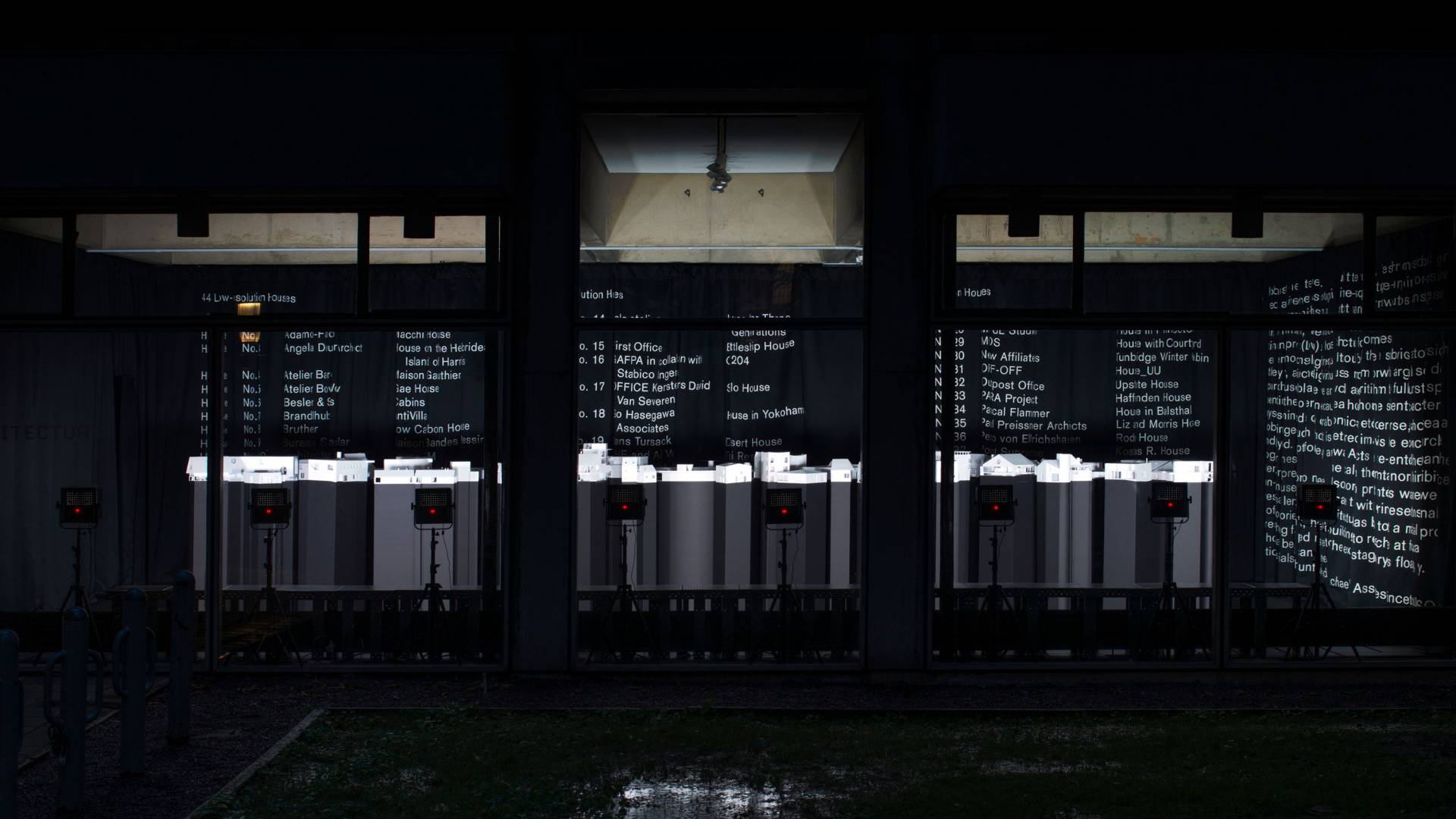
The Princeton School of Architecture’s exhibition “44 Low-resolution Houses,” curated by Associate Professor Michael Meredith, features models of 44 houses presented through a technological and representational lens.
The Princeton School of Architecture’s exhibition “44 Low-resolution Houses,” curated by Associate Professor Michael Meredith, features models of 44 houses presented through a technological and representational lens, with a focus on considering the simplicity of the dwelling. The exhibition is on view in the Architecture Building’s North Gallery through Nov. 9 and coincides with the architecture school’s Low-resolution Houses Symposium Nov. 8-9.
“The house has seemingly become more of a desirable design object — an image, a stage set, a thing, a product — in how it is made and culturally understood,” Meredith said. “The house reflects not just who we are but, increasingly, who we desire to be and how we project ourselves into the world.”
Each of the 44 houses fall into one or more of the following categories of low-resolution: first, houses that vaguely resemble houses, using familiar house elements like pitched roofs, chimneys, windows, doors and porches; second, houses that appear to be constructed, in that one can see the construction, joints and the materials; and third, houses that are composed of basic geometric primitives like squares, circles and triangles arranged in a non-compositional or abstract manner. By categorizing the 44 houses, the exhibition places low-resolution into contrast against high-resolution architectural sophistication.
Meredith said that “44 Low-resolution Houses” renews the need to slow down and take apart architecture. All 44 projects are presented in the same medium, at the same scale, and with the same orientation, inviting comparison.
Graduate student Anna Renken, who fabricated a number of the models, gives a glimpse into how the exhibition team chose to represent each house.

House Number 03
House Number 03
This project, House on the Hebridean Isle of Harris (Scotland, proposal) by Angela Deuber Architect, includes a long wall that extends from the center of the interior out into the landscape. There are private spaces to the north of the wall, a dining area to the south, and a fireplace on the upper level beneath the roof. We typically didn’t include site information, but we decided it was conceptually important in this case to include the full wall, which tapers as it meets the ground. We used a hatch to show the concrete and the thinner frames and mullions for wood.
House Number 07
House Number 07
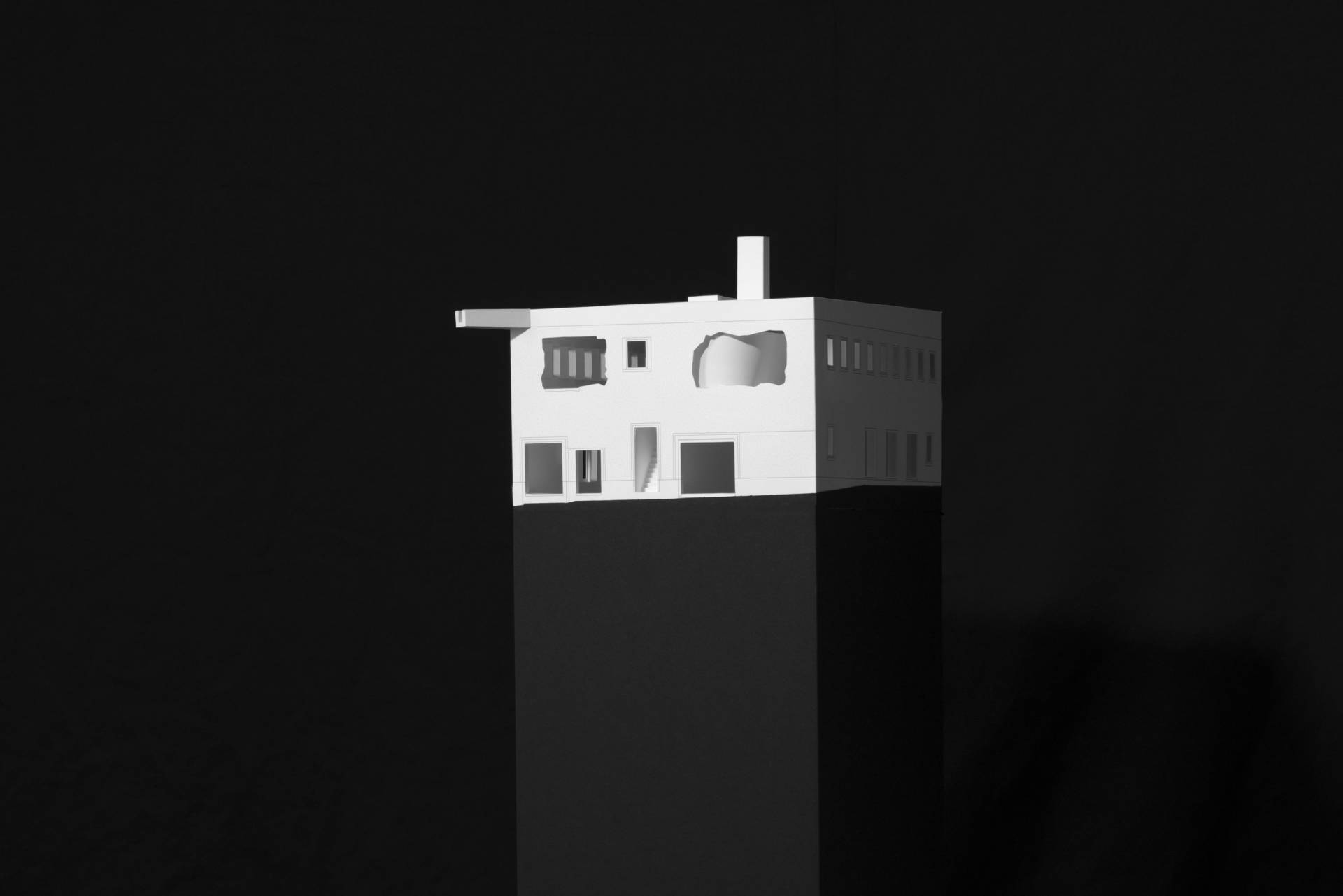
Brandlhuber’s Antivilla (Germany) is unusual among the projects shown in its adaptation of an existing factory building: the upper-level windows were sledgehammered, the roof was reshaped with a prominent rain spout at one corner, and the curtain visible inside acts as insulation, creating warmer and cooler zones. We printed lines and hatches to show the difference between the jagged exterior and rectilinear interior window frames and used a thinner, more translucent paper for the curtain.
House Number 10
House Number 10
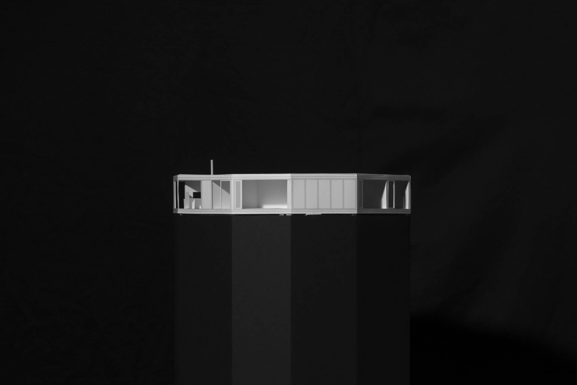
This project, DVVT’s House BM (Belgium), incorporates a variety of materials, colors and textures as well as irregular geometries and built-in furniture framing views within and through the polygonal volume to the surrounding trees. We drew façade panels in colored line work, cut out exterior windows and doors, used gray hatches for concrete texture, and modeled furniture only if it was built directly into the structure.

House Number 30
House Number 30
OFFICE’s Solo House (Spain) has one of the largest footprints of any project in the show, and minimal structure — four rows of nine columns views to a central courtyard from three main living spaces. We printed a hatch to show the metal mesh material and used the ring-shaped roof and concrete foundation to maintain the shape of the model.
House Number 41
House Number 41
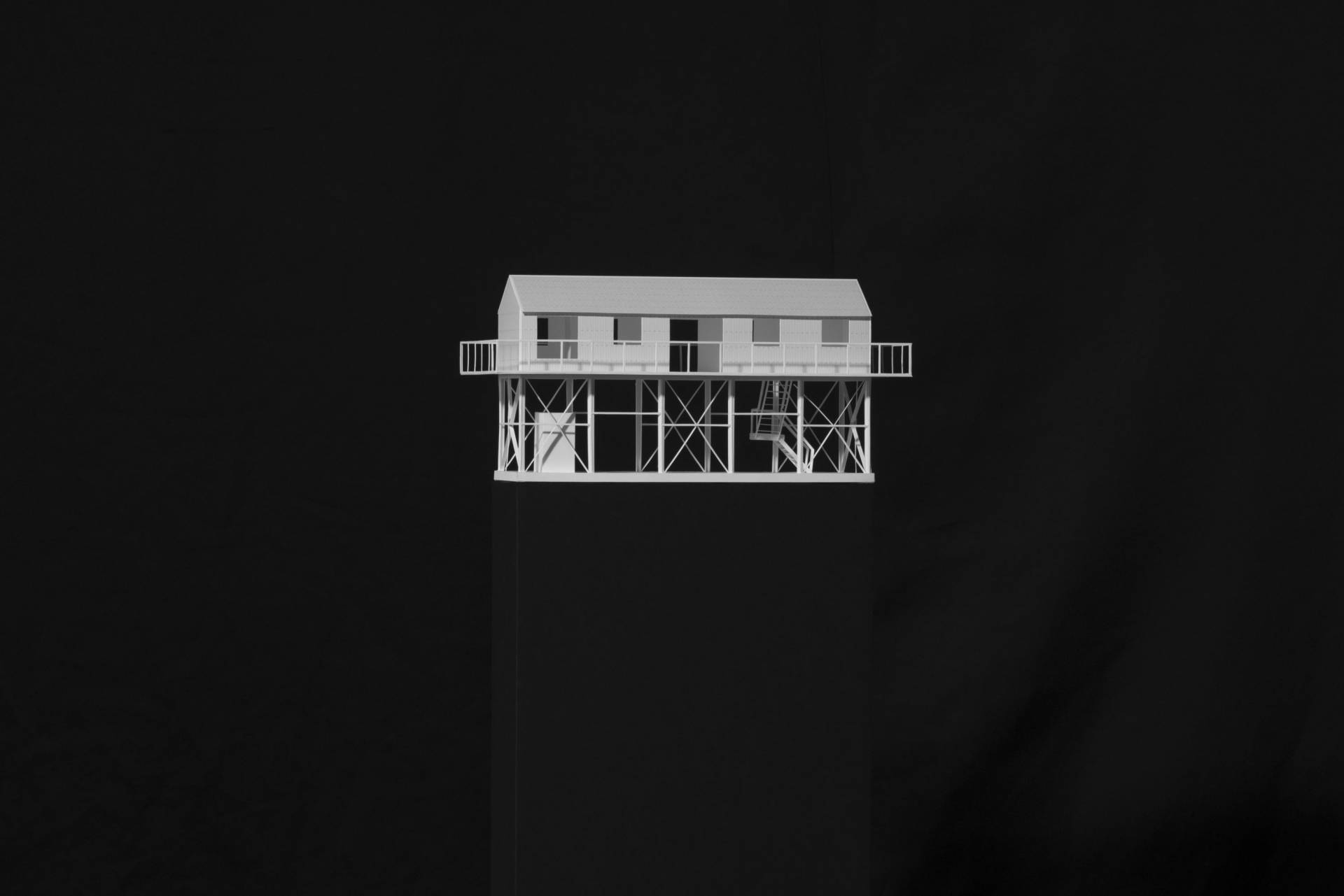
House in Rokko (Japan) by Tato Architects has one of the smallest footprints in the show, with a glazed ground level below the more private living space clad in corrugated steel. To show this, we developed a system of U-profile paper beams that we also employed in other projects with exposed structure. We used different hatches to indicate the different types of corrugated steel in the project, and showed the bolts on the facade and roof because we found them to be important to the design.

House Number 44
House Number 44
The cantilevering structure, exterior pool and irregular adobe bricks stand out in WORKac’s Arizona House, a reinterpretation of the 1970s “earthship” concept incorporating new sustainable technologies. We printed blue line work for the water and treated the ladder to the pool and rooftop fireplace as integral parts of the project. The brick hatch of the façade (which also covers the fireplace) is irregular and more of a brown tone than the red used for standard brick elsewhere.
