Wallace Social Sciences Building
For more than 20 years, the Harvard Science Center (below left) has stood
as the most profane building to be found on any U.S. university campus.
Not only is it unspeakably ugly, but, inasmuch as it was constructed with
funds donated by Edwin Land, the founder of Polaroid, its striking resemblance
to a giant Polaroid camera pointed at the sky is the one of the most egregious
examples of pandering to a donor by any university. (For the record, the
architect has vigorously, but ultimately unconvincingly, denied that the design
was in any way inspired by the camera.)
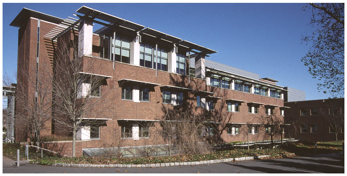
However, the recently completed Wallace Social Sciences Building (below right)
is a worthy rival to the Harvard Science Center. It is somehow simultaneously
disfunctional, boring, and profoundly ugly. (This is difficult to achieve.
Many Frank Gehry buildings are disfunctional and ugly, but hardly boring.
Box-like buildings are boring, but rarely especially ugly or disfunctional.)
The picture below shows the north side of the building. Despite the extensive
plate glass on the ground floor, Wallace manages to be reminiscent of a minimum
security prison (one of the inmates has just been released). And why are there
sunshades on the north side of the building?

The south side of the building (below) has more of the look of a Soviet-bloc
apartment building, hastily assembled with available materials.

A closer view of this side of Wallace shows that those materials include
recycled I-beams, catwalks, and storm drains. There is some suggestion that
these metal sunshades are meant to be trellises for climbing plants, but the
Navy surplus, battleship grey paint probably contains too many toxic components,
originally meant to discourage barnacle growth, to permit attachment of the ivy.

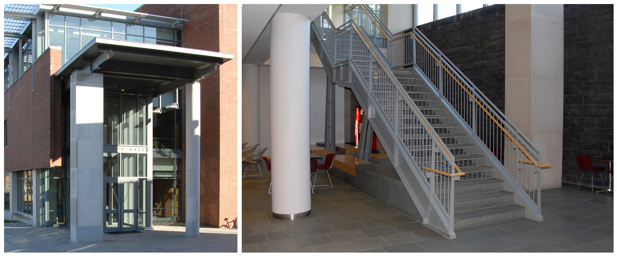
The asymmetric portico (below left) has been mentioned elsewhere, and this
motif is carried into the building (below right), where the "grand entrance"
consists of an industrial steel staircase, flanked by cylindrical and rectangular
concrete columns, leading into a subterranean chamber lined with rough-hewn,
possibly artificial, black rock. I seem to recall similar designs in Doom
or Return to Castle Wolfenstein.

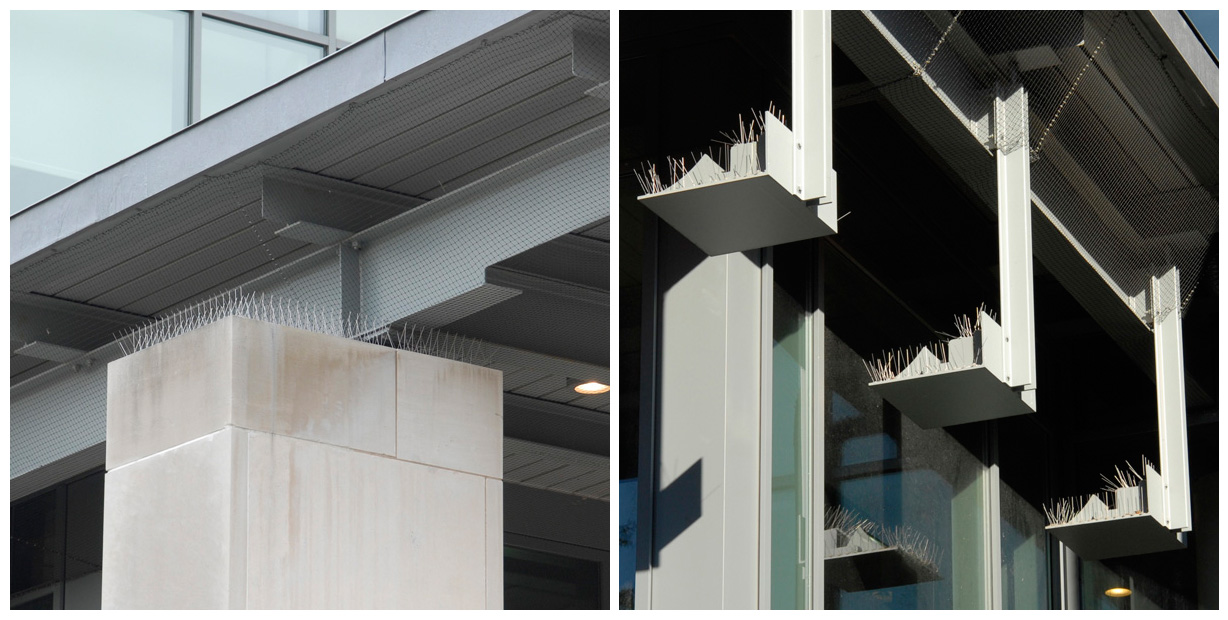
So poor is the design that Wallace was not even complete before the university had
to install thousands of vertical wires to discourage pigeons from roosting on the
remarkably mismatched column-crossbeam interfaces (below left) or on the
preposterous, heavy steel, entrance lamp fixtures (below right).

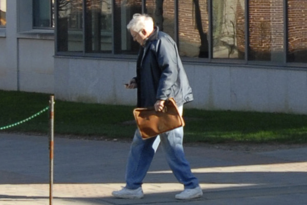
It's no wonder that this man is depressed.
